Modern Retro
How someone from advertising with zero coding experience built a 250-page interactive universe — one prompt at a time. 100 brands reimagined as 1970s storefronts.
Visit modernretro.art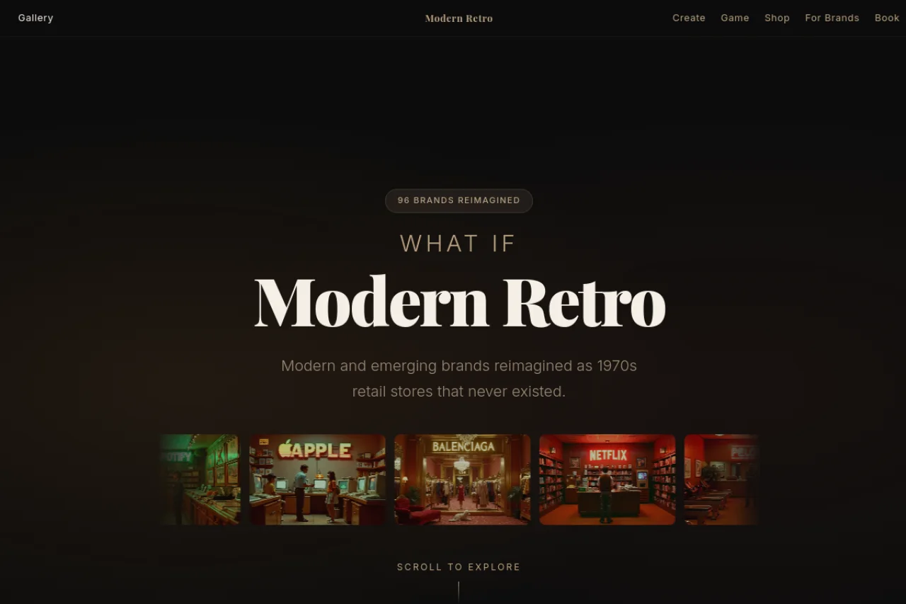
What if today's brands existed in the 1970s?
Not as logos or branding exercises — as actual physical shops. On an actual high street. With window displays, store owners, grand opening posters, price tags, and customer reviews written by fictional locals who'd never heard of the internet.
Modern Retro takes 100 brands — from Spotify to Balenciaga, from Claude Code to Liquid Death — and reimagines each one as a 1970s retail store that never existed. Every brand gets a Kodachrome-warm storefront, a detailed interior, a Wes Anderson-symmetric exterior, and an entire world of supporting content around it.
The images are AI-generated. Everything else is creative direction.
"Anyone can generate AI images. The question is whether you can build a world around them."
46 features across 250 pages
What started as a gallery of 10 images grew into an interactive destination with 46 distinct features. Every feature reinforces the same fiction: this is a real high street, circa 1976.
From advertising to engineering
I'm not a developer. I've spent my career in advertising — in creative and strategy, leading teams, pitching clients, shaping how brands show up in the world. But I'd never written a line of production code before this project.
Modern Retro was built entirely with Claude Code — Anthropic's AI coding assistant. Every page, every script, every deployment. I directed. The AI built.
That distinction matters. This isn't "AI made a website." This is someone from the creative side using AI as their engineering team — bringing the same taste, judgment, and vision they'd bring to any campaign. The tool changed. The thinking didn't.
"I didn't learn to code. I learned to direct an AI that codes. The skill is knowing what to ask for — and knowing when it's not good enough."
The choices that shaped the world
Visual Language. Every image follows the same brief: Wes Anderson symmetry, Kodachrome film stock, warm tungsten lighting. This wasn't arbitrary — it's the visual intersection of "clearly 1970s" and "clearly beautiful." The constraint creates coherence. 100 different brands look like they belong on the same high street.
The Text Problem. AI image generators can't reliably render text. Early posters came back with garbled brand names, misspelled words, invented characters. The solution was a hybrid approach: generate textless art, then overlay typography with Pillow (Python's image library). 7 rounds of iteration to get the text bright enough against dark backgrounds.
Dark Theme. The entire site uses a warm, dark palette — deep black, warm cream text, gold accents. The images are the stars. The UI should feel like walking through a dimly-lit gallery, not browsing a website.
Every Store is a Hub. Each of the 100 store pages isn't just a gallery card — it's a portal into the world. Every store page includes: a storefront image, an exterior view, a grand opening poster, a backstory, 13 cross-links to other features, 3 related stores, a "Create Your Own" CTA, and social sharing. A visitor can land on any store and reach the entire site without ever hitting a dead end.
The Audio Layer. Every page loads with a subtle vinyl crackle. Individual store pages get custom ambient soundscapes — a record shop gets funk music, a gym gets rhythmic beats. It's a small detail that transforms "browsing a website" into "visiting a place."
Typography. Playfair Display for headlines (serif, editorial, period-appropriate). Inter for body text (clean, modern, invisible). The combination says "this is a considered publication" without trying to be a 1970s pastiche.
Deliberately simple. No frameworks, no build tools, no dependencies.
No React. No Next.js. No databases. 1,122 static files deployed via Netlify's REST API. The site loads fast, works offline, and will still work in 10 years.
Lessons from building a world
AI is a tool, not a replacement. Claude Code wrote every line of code. But it didn't have the idea. It didn't choose the Wes Anderson aesthetic. It didn't know when a storefront image wasn't right, or when a feature idea was worth building. Taste is the differentiator. The AI amplifies it — it doesn't generate it.
Constraints create quality. One concept. One time period. One visual style. One colour palette. These constraints didn't limit the project — they gave it identity. Every new feature had to answer: "does this belong on a 1970s high street?" If the answer was no, it didn't get built.
Ship, then iterate. The first version was 10 brands on a single page. It was live within hours. Every feature since has been additive — nothing was built in isolation. The site was always live, always growing, always shippable.
Depth beats breadth. I could have built 10 different projects. Instead I built one project with 10 layers of depth. The grand opening posters, the fictional customer reviews, the 1976 price tags — none of these are necessary. All of them make the world feel real. That's the difference between a project and a destination.
Creative people can build. The barrier between "having an idea" and "shipping a product" used to be a development team, a budget, and three months. Now it's a conversation with an AI and the taste to know what good looks like. That changes everything about what creative people can do.
"The question isn't 'can AI build things?' It's 'do you have taste worth building?'"
250 pages of AI-generated 1970s retail fiction. Browse the gallery, take the quiz, go shopping — or just window shop after dark.
Visit Modern Retro