I had 9 years of health data on my phone and had never looked at any of it. Not meaningfully, anyway. I knew my Oura readiness score each morning. I occasionally glanced at step counts. But 3,172 days of continuous data, across four different sources, in four different apps, had never once been combined into something I could actually think with.
That changed in one afternoon.
The problem with health data is that it lives in silos
My health data existed across four completely separate systems. Oura tracked sleep stages, heart rate variability, and readiness. Apple Health had everything from my iPhone and Apple Watch: steps, active calories, blood oxygen, flights climbed. Renpho stored 752 weigh-ins going back three years. NHS clinic visits and a Neko Health body scan sat in PDFs and email inboxes.
Each source is valuable. None of them talk to each other. There is no single view. No way to ask: "How does my sleep quality correlate with my HRV trend? Does my body weight influence my resting heart rate over time? What does my blood oxygen look like across six months, not just today?"
The data exists. The question is whether you can access it.
What I built
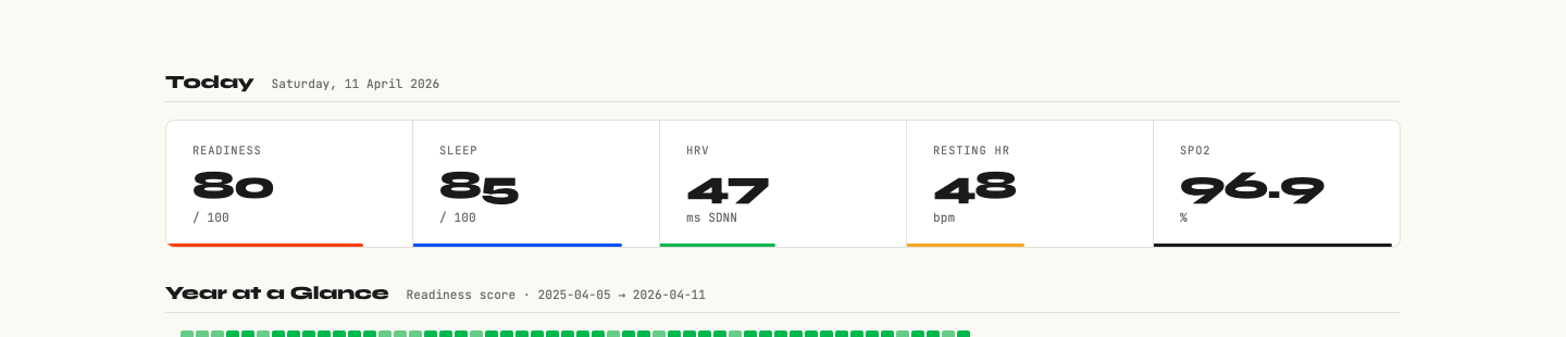
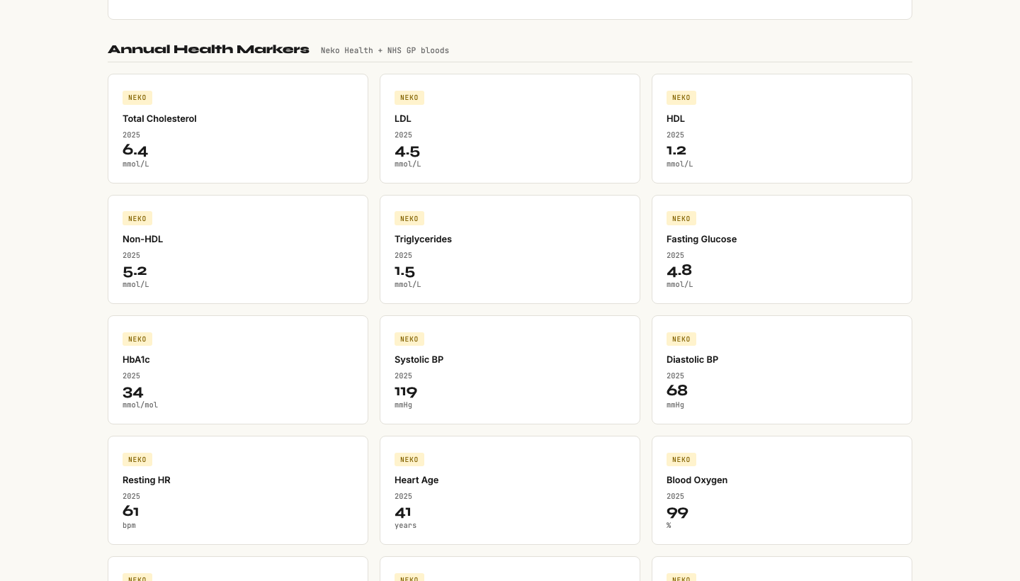
Working with Claude Code, I built a password-protected personal health dashboard. It pulls from all four sources and presents everything in one place: a Today strip with traffic light status on each metric, 90-day trend charts, a year-on-year comparison table, and a section for clinical data like blood panels and grip strength.
The Apple Health import was the interesting challenge. The export file is 2.5GB of XML: 5.4 million individual health records going back to 2017. A standard parser would run out of memory. We built a streaming iterparse parser in Python that processes the file record by record, extracting exactly what we needed: steps, active calories, flights, resting heart rate, HRV, blood oxygen, weight, body fat, respiratory rate, sleep.
3,172 days of data imported. All of it now connected.
What I found
Three things surprised me.
First: my resting heart rate is 48 bpm. I had no idea. That is athletic territory, typically associated with people who train seriously. I do not train seriously. But years of consistent activity and decent sleep hygiene have quietly produced a cardiovascular baseline I did not know I had.
Second: my biological age is 35. I am 39. The Levine phenotypic age formula combines nine biomarkers (blood glucose, C-reactive protein, albumin, creatinine, lymphocyte percentage, mean corpuscular volume, alkaline phosphatase, white blood cell count, chronological age) into a single number that predicts mortality risk better than individual markers. My result: 4 years younger than my passport. When it came back as 35, I didn't feel validated. I felt embarrassed that I'd had nine years of data sitting on my phone and had never once thought to ask it a question.
Third: my cholesterol needed flagging. LDL 4.50 mmol/L. Non-fasting results are typically elevated by 0.5 to 1.0 mmol/L versus fasting, which means the real number could be meaningfully different. I would not have noticed this sitting in isolation in an old GP letter. In context, alongside a full panel view, it became something to act on: book a fasting lipid panel.
None of these findings required any special analysis. They required combination. They required seeing everything at once.
What this taught me about using AI for personal intelligence
There are four things I would tell anyone building something like this.
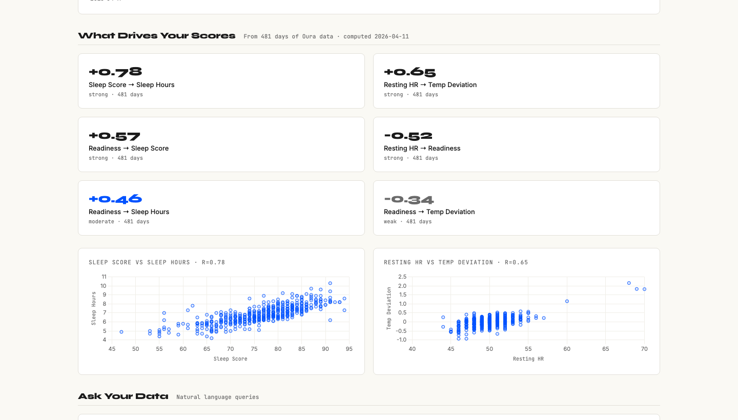
Snapshots lie. Trends tell the truth. A single bad night's sleep looks catastrophic on a readiness score. A 90-day rolling average tells you whether your recovery is stable, improving, or declining. My blood oxygen reading of 96.9% looks marginal in isolation. In context of a stable 30-day trend, it is a "watch, don't panic" signal. Context changes the call every time.
One number can reframe everything. Twelve individual health metrics are difficult to hold in your head simultaneously. "Biological age 35 at 39" is a story. It gives you a frame for interpreting all the other numbers. This is what good dashboard design does: it finds the narrative, not just the data.
Brief the machine like a designer. "My SpO2 is 96.9%, should I be worried?" produces a generic answer. "I am 39, non-smoker, Oura readiness averaging 74 over 30 days, SpO2 trending at 96.9% with no symptoms. Interpret this and tell me what questions to ask a GP" produces actionable intelligence. The quality of the context determines the quality of the output. Your job is the brief, not the analysis.
You can own your own data. Apple holds your health data. Oura holds yours. Every wearable company holds a piece of you. When you export it, parse it, and run your own dashboard, you own it. There is no subscription paywall between you and your own biology. That shift matters more than it sounds.
The part that surprised me most
I thought this would be a technical exercise. It turned out to be a thinking exercise.
The act of building a dashboard forces you to decide what matters. What belongs in the Today strip? What is a lagging indicator versus a leading one? Which metrics should trigger an alert, and at what threshold? Every design decision is actually a question about what you value and what you want to monitor.
I also found that having the data did not, by itself, make me healthier. What it did was make me a better patient. My next GP appointment will be different. I will walk in with 90-day trend charts, a biological age calculation, and a specific question about fasting lipid panels. That is a different kind of consultation than "I'm feeling fine, just checking in."
What I would do next
The dashboard now rates a 9/10 for my own use. The remaining 1 is achievable: adding grip strength data from the Neko scan in April, logging supplement protocols, and getting the GP referral for a fasting blood panel and overnight oximetry test (to properly assess whether SpO2 at 96.9% warrants investigation for sleep apnoea).
What I would not do is productise this in the obvious way. There are already apps that try to aggregate health data. Most of them fail because they optimise for comprehensiveness rather than insight. The goal is not more data. The goal is understanding what the data means.
The question I keep coming back to: why is this level of clarity not the default? The data exists. The tools to parse it are free. The AI to interpret it is accessible. The only thing missing is the knowledge that this is possible.
If you have a wearable and have never exported your data, this is worth an afternoon. Not to optimise yourself. To finally meet yourself.