Most book library sites are databases with nice fonts. You scroll, you search, you leave. The Visible Shelf started that way too. 200+ books, a Python generator, editorial design. It worked. But it did not make anyone want to stay.
So I rebuilt it as something you play with. 200+ book covers scattered across a warm linen canvas like someone tipped a shelf onto a coffee table. You can drag them around, flip them over, shake the pile, scatter it outward, spiral it into a vortex. Filter by category. Pick your five favourites and generate a shareable card. Take a quiz to find your next read. Every visit is different. Every session is yours.
No React. No canvas library. No physics engine. Just vanilla JavaScript doing things it probably should not be able to do.
Why a bookshelf should be an experience
Every person in media, strategy, or culture has a bookshelf. Most of them are on Goodreads, which is functional in the way that a government form is functional. It works. It is not something you would ever want to spend time with. The design says nothing about your taste, your point of view, or why these specific books matter to you.
A bookshelf is autobiographical. The books you choose to display say as much about you as the work you have done. And if you believe, as I do, that taste is a professional skill, then presenting your influences should feel like something worth exploring, not just browsing.
The original Shelf was editorial. Clean typography, generous whitespace, Monocle-inspired layouts. That is still there on the browse page. But the homepage needed to feel different. It needed to feel like walking into someone's flat and finding their books scattered across a coffee table. Physical. Messy. Personal. The kind of thing you would actually pick up and rearrange.
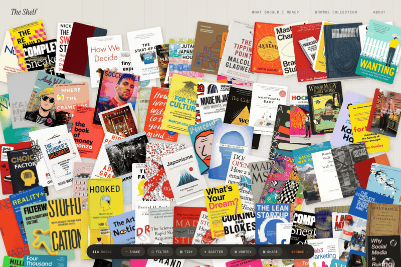
The pile
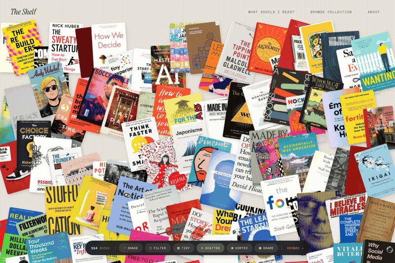
When you land on The Visible Shelf, 200+ book covers are scattered across the screen at random angles on a warm parchment background with a subtle wood-grain texture. Each book is sized proportionally to its star rating: five-star books are noticeably bigger. The layout is seeded randomly per session, so it looks different every time you visit but stays consistent while you browse.
Every book is draggable. Click and drag to rearrange the pile. Hover and a book lifts toward you with a deeper shadow. Tap once and the book flips over to reveal its title, author, a short description, and a five-dot rating on the back. Double-tap to land on the book's full detail page. It feels tactile in a way that most web experiences do not.
Then there is the control bar. A dark frosted-glass pill fixed to the bottom of the screen with six buttons, each triggering a different animation across every cover simultaneously.
The effects
Shake. Every book flies to a new random position with a wobble animation. Staggered timing so the pile feels organic, not mechanical. Like picking up the table and giving it a good rattle.
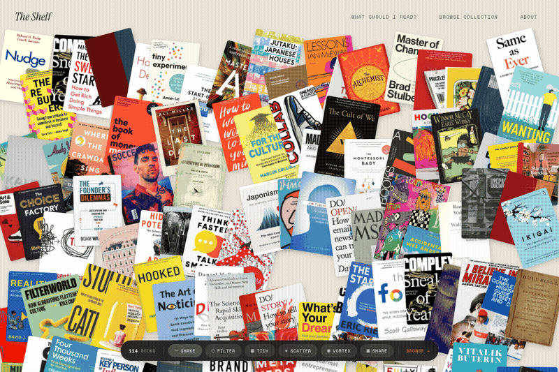
Filter. Twenty coloured category pills slide in from the top: culture, strategy, technology, design, fashion, japan, curation, and more. Select one and the matching books animate into a tidy upright stack with a glowing terracotta shadow, while everything else fades to near-invisible greyscale. Clear the filter and they spring back to their original positions. It turns the pile into a focused collection without losing context.
Tidy. All 200+ books snap into a clean uniform grid. No rotation, no chaos. It holds for two seconds, then scatters back into randomness. A brief moment of order before the mess returns. Surprisingly satisfying.
Scatter. Every book flies outward from the centre. Each cover launches in its radial direction, spinning up to 720 degrees, shrinking and fading. Then they spring back into a new layout with a bouncy overshoot. It is absurdly fun and completely unnecessary.
Vortex. The opposite of scatter. All 200+ books spiral inward along a tight spiral path, spinning and shrinking into a cluster at the centre. Then they burst outward again. Like a black hole that changes its mind.
Flip-to-reveal. This one does not need a button. Tap any book on the pile and it flips 180 degrees with a 3D CSS transform. The back face shows the title in italic terracotta serif, the author in small caps, a one-line description, and a dot rating. It unflips after four seconds. A small interaction that makes you want to go through the whole pile one by one.
Pick 5: My Shelf
The share button triggers a different kind of interaction entirely. A red banner slides in: "Pick 5 more books." The pile dims. Tap a book and it brightens, a numbered badge appearing in the corner. Pick five and a "Generate Image" button appears.
It renders a 1200x630 canvas: your five chosen covers arranged on the parchment background with a wood-grain texture, each with its title and author beneath. "My Shelf" in italic serif at the top, the site URL at the bottom in terracotta. Download as PNG or copy a shareable link.
Beyond the pile
The homepage is the signature experience, but the site has grown well beyond it. There is a "What Should I Read?" quiz that asks five questions and recommends a book from the collection. Stats and timeline pages visualise the library by category, rating, and year. Nine curated reading lists (The Strategy Stack, Taste Education, Weekend Reads) and seven collections (Coffee Table, Gift Worthy, Essential Reading) each with their own auto-generated OG social cards.
Every individual book page features a 3D page-edge depth effect on the cover, making the books look physically present on screen. The browse page at /books is the more conventional experience: full-text search, category filters, a card grid. Everything you would expect from a well-made library site. But the homepage is where the opinion lives.
Still zero frameworks
All of this runs on vanilla JavaScript. No React, no Three.js, no physics library. The drag system is native mouse and touch events. The animations are CSS transitions triggered by JavaScript. The flip is CSS 3D transforms with perspective. The seeded random uses a linear congruential generator stored in sessionStorage.
The data architecture is clean: the homepage fetches from a single books.json file, so adding a book to the JSON and running the Python generator automatically updates the pile, the browse page, the book's detail page, the quiz pool, and every collection and list it belongs to. One source of truth, many surfaces.
Why this matters
I have built 20+ products in the last eighteen months. Most of them are functional. They solve a problem, present information, provide a service. The Shelf does something different. It makes you want to stay. Not because of the content, but because of the interaction. The content is the reason you care. The interaction is the reason you linger.
That distinction matters if you work in product, brand, or culture. The gap between "useful" and "delightful" is not a technology problem. It is a taste problem. And the solution is almost never more complexity. It is knowing what feeling you want someone to have, then building the simplest thing that creates it.
200+ books. One JSON file. Zero frameworks. A pile you cannot stop rearranging. That is The Visible Shelf.
